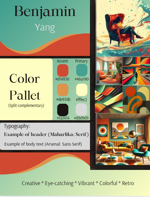
Personal Design
This design was for a class where we were told to create a design theme. I chose retro colors and used different elements, like the waves to create a intriguing image.
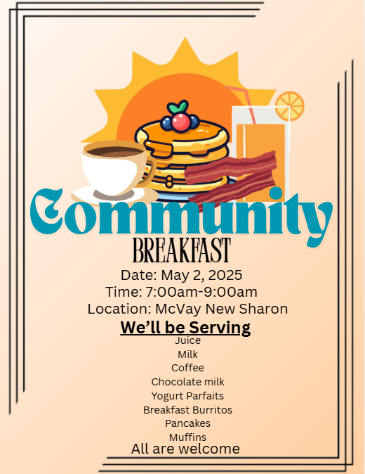
Community Breakfast
This was a poster I created back in high school to promote a community breakfast that the student council was holding. I tried to go for more of a bright morning vibe for this particular graphic.
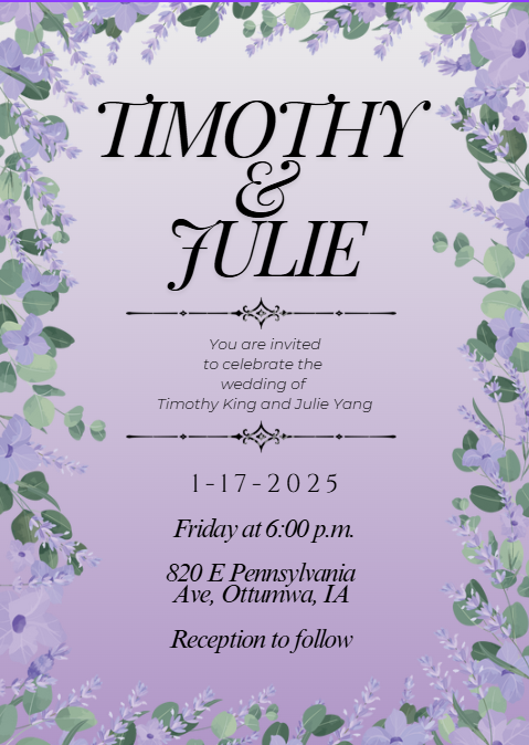
Wedding Invites
I was asked to make this for my sister’s wedding. She chose the colors and some design elements she wanted, and I put it all together.
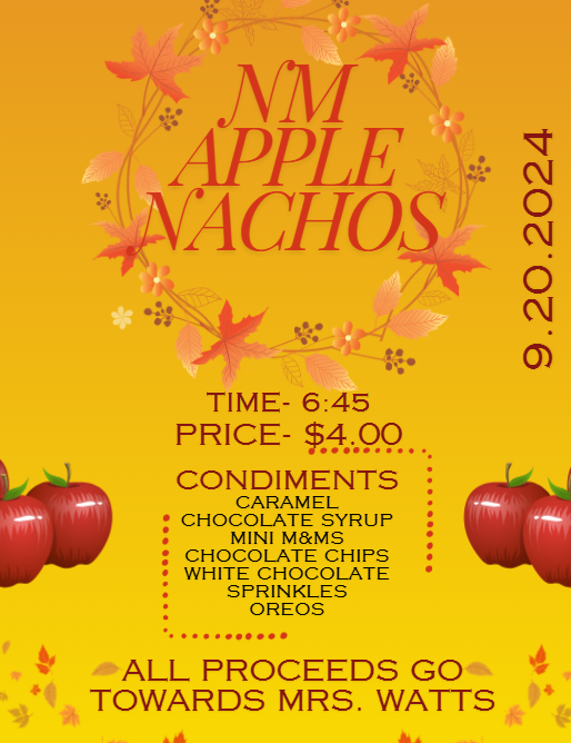
Fundraiser
This fundraiser was for a teacher at my school who had heart problems. For the design of this poster, I tried to go for a fall vibe with the red, orange, and yellow colors, and leave elements sprinkled throughout.
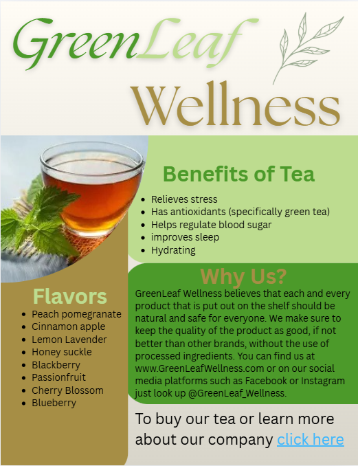
Infographic
On this graphic, I came up with information on a fake business and put it all together on this infographic. I chose the earthy colors because the fake business I had was a wellness company.
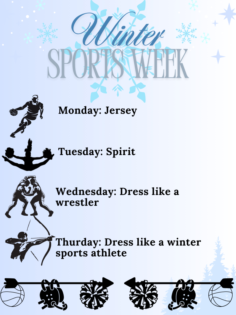
Winter Sports Week
In high school, we had a week where the school celebrated a different sport each day. I chose more icy colors like blue and white, to evoke a winter feel. I used a silhouette of each sport’s players to represent each day of the week.